Wednesday, April 20, 2011

Mohawk Community Builders Project

One of our last project for the fourth semester was to design a new logo for the Mohawk Community Builders and to come up with a poster. I came up with three different logos and then made each one black and white to make sure they were a strong design without the colour.
For the logo we had to incorporate the Mohawk logo without altering it to much. I decided to leave it the way it is and build around it.
Here are some of my thumbnails for this project:
IMG
Here are my logos:
Mohawk Community Builders Concept Logos
I went with the logo at the very top, its simple but you get the idea.

Here is my poster design:
Mohawk Community Builders Poster
I used the Mohawk colours as a gradient in the background with silhouettes of tools and finished houses on the top.

Tuesday, April 12, 2011

illustration Friday: Bottled

This weeks illustration Friday word was bottle. I wanted to illustrate planet earth melting into a plastic water bottle seeing as plastic is one of the factors to global warming, and advertisements seem to be focusing towards recycling more and more.

illustration Friday: bottled

Wednesday, April 6, 2011

Visa Billboard Design

For one of my illustration classes we had to come up with a design for a billboard that would catch the viewers eye within four seconds. We could either do an ad for Visa or Kodak, I decided to go with a Visa advertisement. This project had to be painted (which isn't my favourite medium..) so I went with a simpler design. I chose the famous castle from Disney World with fireworks going off in the background hoping to draw attention from the viewers. We were limited to a maximum of four words, so I chose "Experience it". The final product was completed on a 7.25" x 15.5" board.

Here is my first step:
Step 1
When I was painting the castle I thought just the plan white silhouette with the rough bottom looked pretty cool, but not good enough for a final product.

Step 2:
Step 2
I was pretty happy with the way everything was coming along, especially the text

Step 3:
Step 3
The big white rectangle in the corner is for the visa logo, the colours for that were pretty tricky to mix.

Step 4: Finished Product
Final Product
The fireworks were a bit tricky to illustrate.. I have never had to paint them before. I am fairly pleased with the way this came out thought!

Sunday, April 3, 2011

Life's Greatest Duet

This weeks illustration Friday word was: Duet. I wanted to do a silhouette style with two different colours, with lighter and darker shades of the colours to show different values. When I think of the word duet I picture a couple doing a waltz like dance. I like everything about how people used to live in the 40's, 50's, 60's and wished that kind of style was still around today.

illustration Friday: Duet

Friday, April 1, 2011

More than just toys!

This weeks word was Toy. First thing I thought of was Toy Story and how I loved them growing up. I thought of the newest character to the Toy story: Bonnie. The little girl who absolutely loves her toys!

This is my version of little Bonnie holding Buzz and Woody in her hands.
illustration Friday: Toy

I went with a different style then what I usually work in, I didn't include legs, arms or her neck. I thought it would be good to switch things up a bit!

Saturday, March 26, 2011

Absolutely Green

For this weeks illustration Friday word: Cultivate I thought of a animated movie from my childhood: A Troll in Central Park. Which is about a troll who gets banished from his own kind because he loves beautiful flowers and green things where as his kind hate these things. Stanley has a magical green thumb which he can grow any type of flower he wants. When I saw what the word was for this week I knew I wanted to do something with Stanley. I wanted to keep it simple this week so I illustrated Stanley with the words from one of the songs he sings: "We could all live in a world that's bright and shiny and absolutely green!" beside him.
illustration Friday: Cultivate

Wednesday, March 16, 2011

Photoshopped Graffiti Art

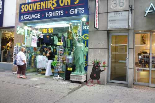
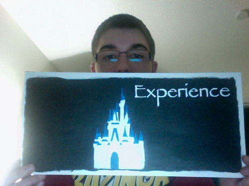
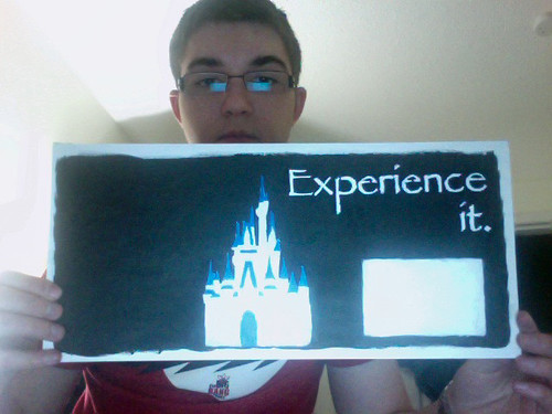
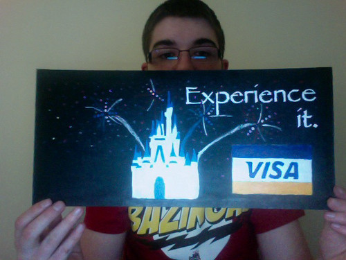
This piece was done for a project for class. We took a look at an infamous street artist named "Banksy" who is well known for his street art and the the messages they portray. Our task was to create our own graffiti art without actually going out and vandalizing public property. So we had to create an image and then bring it to photoshop and make it look like it is actually on a building. I decided to draw a rat standing beside a small version of the statue of liberty from a souvenir shop. I went with a rat because this picture was taking in New York City and it made me think of alleyways and sewers and rats running around in them.

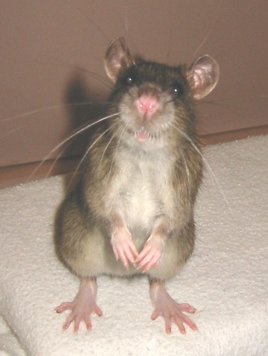
I used this picture of a rat for reference for my drawing.
Reference image

This is what I came up with..
Liberty Rat
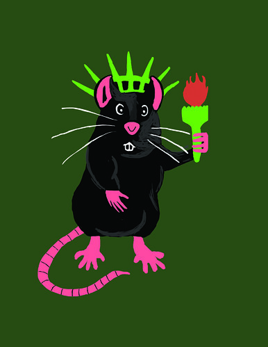
I wanted to make the rat seem as if it was trying to imitate the statue of liberty, it is wearing a liberty hat and holding a mini torch. I drew this in photoshop.

After I finished drawing the rat I had to bring it into the picture and make it look realistic. I placed it into the photo and transformed it down to the right size to fit on the wall. Then I played around with the layer modes until I found the right one. I ended up going with the multiply layer.

Here is the finished product..
Photoshopped Graffiti Art