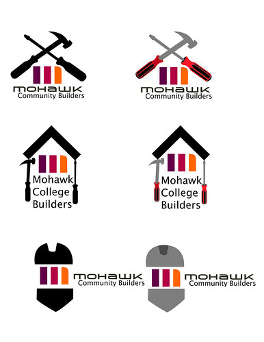
For the logo we had to incorporate the Mohawk logo without altering it to much. I decided to leave it the way it is and build around it.
Here are some of my thumbnails for this project:

Here are my logos:

I went with the logo at the very top, its simple but you get the idea.
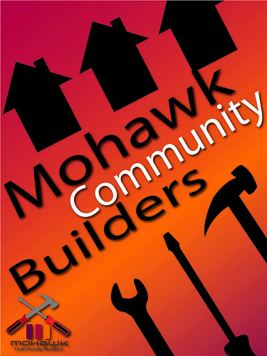
Here is my poster design:

I used the Mohawk colours as a gradient in the background with silhouettes of tools and finished houses on the top.

No comments:
Post a Comment